Packaging to Make the Right Impression
By Elena Langlois
General Sustainability Coca-Cola Coca-Cola British Columbia Raspberry Costa Rica Rainforest Artisian Water OUAI Pretty Vulgar Rainforest Water RFW United Beauty BrandsA monthly look at some of the hits and misses in the packaging world from the viewpoint of Joe Public, Canadian Packaging magazine’s revolving columnists. From the November 2019 issue.

Portability is a key factor driving consumers’ continuing choice to purchase bottled or canned beverages, be it water drawn from a natural source, or soft drinks concocted in a factory. That said, there is merit to the argument of reducing carbon footprint by moving away from single-use packaging. The mantra is, when possible, reuse; when not, recycle. From the country renown for eco-tourism and Green stewardship, Rainforest Water RFW, S.A. of Campos Lapa Verde, Sarapiqui, Costa Rica, integrates reusability at a consumer-enticing price point into its Costa Rica Rainforest Artisian Water brand. Holding 500-ml of locally-source water, the container measures 25 centimeters in height and a grip-friendly 5.8-cm in diameter, making it is comparable in size to purpose-made reusable containers. Retailing at $4.99, consumers can enjoy the refreshing taste of water inside, and reuse this durable and attractive stainless steel container for a mere couple dollars more than similar-sized singleuse water bottles. Emblazoned with a colorful high-resolution image of a Scarlet Macaw parrot lithographed on the exterior of the container, the brand makes a compelling statement on its eco-friendly mindset.

While water quenches thirst, I find nothing delights the palate like a good old Coca- Cola. There’s something about the bubbly, caramel syrupy flavour that strikes a chord of contentment with me. The iconic brand underwent many flavor reiterations over the last century: some hits, some misses. This past summer, I thoroughly enjoyed the special Canadiana-inspired release of Coca-Cola British Columbia Raspberry flavor, sweetened with good old-fashioned cane sugar. Bearing all hallmarks of the iconic and trademarked glass bottle design, these 355-ml bottles stand 24-cm tall, with the script nameplate and flavor printed directly onto the bottle in white ink to provide stark contrast to the dark beverage inside. Topped with a paper neckband in a raspberry rouge, with a color-matching bottle cap, this package is very effective at distinguishing the novel flavor from other summer special releases. Sold in four-packs, the bottles are bundled together in a convenient paperboard carrying case bearing the logo across the front of the panel—superimposed over a rustic line-art illustration of a raspberry—with the raspberry rouge handle in the background reinforcing the delicious flavor variety.

In the highly competitive marketplace of women’s beauty products, Boca Raton, Fla.-based Pretty Vulgar’s The Ink gel eyeliner stands out with smart packaging design. Considering gel eyeliner is applied to the eyelid with a brush, the container is wittily designed to look like an inkwell, not unlike one I would envision once sitting on the writing desk of Edgar Allan Poe. The primary package is a shallow black glass jar, topped with a brass-tone screw-cap stamped with Pretty Vulgar logo featuring a silhouette of a bird (sadlynot a raven), and a brass band wrapped around the circumference of the jar. The wraparound paper label is likewise emblazoned with the brand logo, creatively flanked by writing plumes. The jar itself is packaged within a cardstock sleeve reinforcing a paperboard box, featuring embossed gold text and containing an information insert printed in no less than 20 different languages. Holding six-grams of eyeliner, this container holds nearly twice the volume of compared to other brands in this category to make it a very sensible purchase, wink-wink.
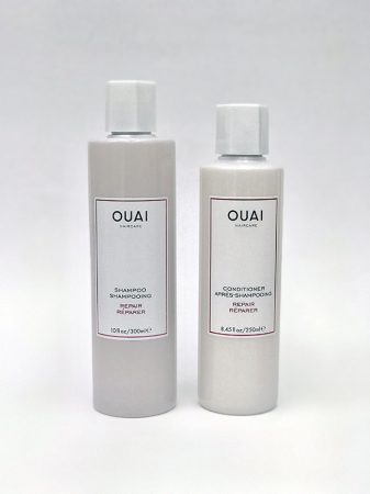
The OUAI brand of hair-care shampoo and conditioner from the Los Angeles-based United Beauty Brands features a simple translucent plastic cylinder bottles that are topped with a hexagonal white push-click cap. A simple, clean rectangular label with crisp black sans-serif text identifies the brand and product, with the cold-stamped foil borderlines and lettering suggesting a promise of luxurious hair washing experience. Oddly, the shampoo bottle contains 300 milliliters of products, compared to the 250-ml conditioner container, which leaves me asking, “Why Ouai?” This flies in the face of a long-standing convention whereby shampoo and conditioner packaged in matching bottle sizes—unless a consumer luckily comes across a “Bonus Size” bottle offering more product for the same purchase price. With the 19-cm shampoo bottle standing a little taller than the 18-cm conditioner container, reaching for the right bottle in a half-asleep state during the morning shower is easy enough, but synchronizing the usage of each of the two products just right so that they last exactly the same amount of time is another proposition altogether.

Elena Langlois is a Toronto-based communications professional.
Advertisement